Personal “README”

Software projects often come with a README file. Important bits of documentation live here: set-up information, configuration options, known bugs, etc. A well-written README can make it easier to use a new program.

Michael Lopp (VP Eng @ Slack) gets credit for popularizing the concept of a personal README – in his words: “a user guide for me and how I work.” The concept resonated widely and personal READMEs are becoming more common (and appropriately critiqued).

I decided to write one. It proved a valuable exercise, and I’ve since shared it with my team. I figured I’d post it here, too – perhaps you’ll find it helpful! (Or at least amusing 😉…)


Charley’s README

Hey there! This is my personal README. It’s meant to:

  • Help you get the most from our working relationship
  • Proactively identify patterns in my behavior
  • Make things explicit that were previously intuited or inferred

It is, in no way, meant to:

  • Replace substantive conversations or trust-building
  • Excuse my mistakes or unproductive behaviors
  • Force you into operating “on my terms”

For new folks I’m going to work with closely, we’ll likely discuss this document explicitly as we ramp up together. For folks I’ve worked with for some time, I hope everything here rings true.

How I communicate

I think it can be hard to convey nuance/intent in short-form writing (e.g. Slack, code reviews, emails). As such, I do my best to explicitly indicate urgency+expectations. For example, I’ll often start a conversation with:

  • “Whenever you have a second, could you …”
  • “Just FYI: …”
  • Occasionally: “Hey, urgent question: …”

For me, these qualifiers help make text-based communication less stressful. I’d ask that you loosely follow this pattern when pinging me – notably, if you have something that is time-sensitive, please say so upfront.

Other notes on my written communication:

  • I use the “:thumbsup:” (👍) emoji to mean “makes sense”, “got it”, and “sounds good”. I use it a lot.
  • In longer conversations, I’ll often type out “Mmmm” (or “mmm”) mid-conversation or as you’re typing. This is me “nodding my head” and indicating “I’m following along, keep going”.
  • I often respond to asks/requests with “kk” or “roger” or something equally short. This can come off as brusque or disagreeable, but that’s not my intention. (If I disagree with an ask or don’t want to do something, I’ll articulate my concerns. I strive to not be passive-aggressive.)

How you work

I believe that developing strong time-management skills is key to a fulfilling + sustainable + productive engineering career. To me, this means knowing when and where you work best, and how to best integrate work with the rest of your life. Some people have this all figured out; others are still experimenting. (And it’s no fixed thing – life changes over time!) As such, the details of your work routine is up to you: starting early/staying late/weekends/etc (as is appropriate per our company’s expectations and office culture). I think creating healthy work/life boundaries are crucial, but I also believe that they look different for everyone. If you’re feeling self-conscious about hours or location, or would like to request specific accommodations, let’s talk about it live.

Responsiveness

I often work early (MT timezone) and send messages out before others are working – I don’t expect you to be online or respond to these! (I just can’t keep them all queued up in my head.) Similarly, if you send me messages at night, I’m likely not going to respond quickly. I rely on you to set your devices’ notifications settings appropriately to respect your own boundaries.
There are methods of escalation (e.g. OpsGenie) for emergencies.

How I give feedback

I aim to make 90% of my feedback positive. Following meetings or Slack interactions, this often looks something like:

  • “I thought you responded to [Person X]’s questions well. It felt like you came well-prepared.”
  • “Thanks for being proactive in surfacing [Concern X]”
  • “I appreciate you jumping in at the end there – I forgot you had worked on [Project X]”

And in code reviews, it might be:

  • “Nice job handling this edge case, great attention to detail”
  • “I like how you’ve split this into manageable chunks – makes it way more readable”
  • “This comment is super helpful! Makes understanding this block 1000% easier”

When you get such a comment from me, don’t feel obliged to reply or elaborate. In general, I try to give feedback promptly, so expect such commentary to arrive early and often (and typically via Slack).
I have a framework for giving constructive/“negative” feedback, but it’s out of scope for this document. If you’re my manager or report, I expect we’ll discuss it live at some point.

1:1s

I like to have weekly, 30-minute 1:1s with my manager and reports. The nature of these 1:1s will vary over time, but here’s my general approach.

With my manager: I’ll usually come prepared with things I want to discuss. I like to write down action items as we’re talking. A common topic is “troubleshooting”, things like:

  • “[Meeting X] seemed to go poorly, and I’m not sure why.”
  • “[Person X] and I aren’t gelling on this project, can we discuss?”
  • “Does it seem like [Project X] is dragging on?”

The goal for these topics is to get your perspective and see how I can adapt or you can assist.

With my reports: 1:1s are a time to discuss what’s on your mind. Ideally, over time, we’ll surface ways I can help improve your day-to-day. Good starting points are often things like:

  • “I feel like [Project X] is going poorly/well/just OK.”
  • “I’m getting sick of writing Javascript components all day. Can we make a change?”
  • “[Person X] sits next to me and all their phone calls are driving me nuts.”

I’ll also use the time to rely any important top-down info I’ve got. Expect me to jot down TODOs as we talk – it’s the only way I can remember things. Some 1:1s will flow with good conversation, and some will be awkward and fluffy – that’s just how these things work.

I think those are the biggies. Please let me know if you’ve got any feedback on it – I hope it evolves over time. Thank you for reading and I look forward to working together!
Charley


The above is a snapshot of my README from August 2019. The living document is available on Google Docs.
Will I always be afraid of insects?

A few nights ago, as I was tidying the kitchen, a loud buzzing noise arose behind me. As I turned to look, something flew right at me. Struct by a sudden fear, I ducked and backed away. Eyes scanning, I quickly spotted it: a large dragonfly had come to rest on the table.

Dragonflies are totally harmless – I had nothing to fear. Yet my body responded as if everything were on the line: my adrenaline had flared, eyes dilated, heart rate quickened, etc. Although my body meant well, this was hardly my ideal pre-bedtime state. This “survival” instinct, I thought, was doing more harm than good.

The next morning, I had another bug encounter. Opening my front door revealed a juicy 2-inch beetle, right at shoulder level. Yet again, my body flared up, and, yet again, that momentary fear quickly turned to annoyance.

It’s worth noting that I’m no insectophobe. I’m generally the person “dealing” with bugs when others get squeamish. (Clearly, I still have some work to do.) It got me thinking, though – what’s at the root of this fear? I don’t have a traumatic history with insects; bugs have never done me any harm. Further, I know that I’m the apex predator, not them. I’m 1000x their size and can literally crush them. So why can bugs still elicit such an intense threat response? Will I ever just “get over” them?

Well, turns out my cognitive brain doesn’t really have a say in the matter:

Fear-relevant information reaches the amygdala prior to any second-hand information from the visual cortex, and a fear response is initiated prior to conscious recognition of the threat. This entails a fast reaction and a better chance of an individual’s survival, even though the amygdala might have got it wrong. (Baynes-Rock, 2017)

Said another way, my body responds to “fear-relevant information” before my cognitive mind can do anything about it. Makes sense: better safe than sorry. But that begs the question – without active cognition, how does my subconscious know what is “fear-relevant”? Does it have its own catalog of “scary things”? And where does that catalog come from? Am I born with it, or do I develop it over time?

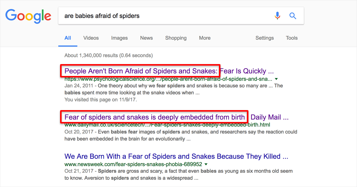
Googling revealed conflicting claims:

Are babies afraid of spiders? Google Search results.

Time to dig into the scientific literature. Vanessa LoBue’s work came up again and again (e.g. 1, 2, 3, 4), but I’m going to pull quotes from Marcus Baynes-Rock’s recent review paper: “Human Perceptual and Phobic Biases for Snakes: A Review of the Experimental Evidence” (snakes, insects – same difference to me)

It appears that humans are born pre-programmed to detect certain snake-y features:

  • Coiled shape: “coiled shapes [affected] detection speeds regardless of whether these were snakes or electric cables”
  • Visual patterns: inborn “neural structures … respond to visual stimuli such as diamond patterns similar to scales, rows of spots moving against a background, hidden shapes, rows of spots moving together, and checkerboard patterns”
  • Slithering: “movement is key to predisposition toward fearing snakes”
  • But not color: “removal of color from the images had no effect on faster snake detection”

Fascinating. Snakes are “scary” by default, then. Does that mean I have no chance to overcome my latent fear of insects? “Where humans outwardly react non-fearfully to snakes … it is still likely that they experience a physiological change in line with a pre-conscious fear response.” So I’ll always be afraid bugs?

Tim Klucken’s research helps us answer this question. Summarizing some of his work, one article states: “there is very little physiological difference between fear and excitement.” Further, “if you learn to anticipate fearful situations then you actually activate the nucleus accumbens, which is the reward center of the limbic system. Thus knowing you’re about to be scared is actually somewhat enjoyable.”

With sufficient preparation, then, our “pre-conscious response” to seeing spiders and snakes can transition from evoking fear to causing excitement. And that makes total sense – just think of all the other “scary” things that we learn to think of as “fun”: bungee jumping, horror movies, bitter foods, etc.

So next time I see a big bug, I’m going to try and convert my inner “Ahhhh, scary!” into “Ooooh, cool!”. I’ll let you know how it goes 🙂

A brief history of Indonesia’s favorite beer

Bintang is ubiquitous in Indonesia. Ask for a beer and you’ll get a Bintang.

Two Bintang beers on resting on the sand at sunset.
The word “bintang” means “star” in Indonesian. Photo by Rubén Crespo.

With net sales up 21% and a dominant 69% marketshare (2016), Bintang is crushing it. So I wanted to know: how did Bintang assume the Indonesian-beer throne?

But before we dive in, a quick primer on alcohol in Indonesia. The traditional brews of Indonesia (and Southeast Asia in general) are made from the locally-available produce – generally rice, palm, and coconuts. Their production goes back 1,000s of years. Only more recently have sugarcane and cereal grains become widespread. “Beer” as it’s generally known – sparkling, glutinous, commercialized – is a colonial import that’s <100 years old here.

Further, the cultural diversity between Indonesian islands leads to varied production and consumption patterns. In some regions (e.g. Java, Bali), foreign and domestic brands are widely available. In others, (e.g. Aceh) alcohol is prohibited entirely. Coupled with massive import tariffs (150% on liquor, 90% on wine), this has enabled hyper-local craftspeople to thrive across Indonesia: home-brews account for 80% of the alcohol consumed across the country (per The Economist).

Given that context, let’s get back to Bintang. As a European-style pilsner, it’s perhaps unsurprising that Bintang’s roots go back to Indonesia’s colonial era.

In 1929, the Dutch government began construction of a commercial brewery in East Java. Operating as Nederlandsch-Indische Bierbrouwerijen NV (“Dutch-Indian Beer Breweries”, NV means it was publicly traded), it began producing and distributing “Java Bier”. Based on what was popular at the time, this beer was likely a Bavarian bottom-ferment made from imported European barley and hops. (Alas, this is pure speculation. The tasting notes for Java Bier have been lost to history.) Per my understanding, Java Bier was the first mass-produced beer in Southeast Asia.

Advertisements of Java Bier.
Java Bier materials courtesy Ratih Swastyka and Beergembira.

Back in the Netherlands, the already-enormous Heineken’s Bierbrouwerij Maatschappij NV (“Heineken’s Beer Brewery Society”, the same Heineken company we know today) decided to focus on going international. New communication technologies and the end of prohibition in the United States made foreign opportunities more appealing than investing further in the already-competitive European market. Thus, in 1936, Heineken acquires a majority stake in the aforementioned Nederlandsch-Indische Bierbrouwerijen NV and renames it Heineken’s Nederlandsch-Indische Bierbrouweerijen Maatschappij NV (“Heineken’s Dutch-Indian Beer Breweries Society”).

It’s hard to know how this acquisition would have affected the taste or availability of Java Bier. Some sources say Heineken brought over “technical advisors” to improve the brewing process. Who knows. Turns out, it wouldn’t much matter – within a few years, World War II consumed the continent. By 1942, Allied forces ceded the Indonesian region to the Japanese, who occupied it until 1945. Following Japanese surrender, the Dutch tried to reassert their colonial rule and the Indonesian National Revolution began. Four years later, the Dutch yielded and Indonesia’s independence was internationally recognized.

During these war years, it appears that Heineken’s brewery was offline. I can only imagine that the grain, materials, and manpower it required were diverted elsewhere. Perhaps it was even retooled for rubber or oil production.

Following Indonesian independence, though, the brewery resumed operation. But Java Bier’s run was over: still operating under Heineken’s Dutch management, the brewery started making “Heineken Bier” instead. This beer was likely based on the same recipe used in other Heineken factories around the world. RIP Java Bier.

Ten years later, in 1957, a period known as Guided Democracy begins in Indonesia. Defined as “a threefold blend of nasionalisme (‘nationalism’), agama (‘religion’), and komunisme (‘communism’)”, this government structure “was intended to appease the three main factions in Indonesian politics — the army, Islamic groups, and the communists” (Wikipedia). Major industries and Dutch-controlled businesses were nationalized, including the Heineken brewery. For the next decade, the national government was brewmaster. Although it doesn’t appear to have immediately changed the recipe, it did change the name – “Heineken Bier” became “Bir Bintang”.

Bintang reached its final form ten years later. In 1967, Indonesia’s Guided Democracy ended and the brewery returned to Heineken ownership. But rather than resuming production of Heineken Bier, the Dutch owners stuck with Bintang. They updated the brand and recipe, releasing “Bintang Baru” (“New Bintang”). This new beer was essentially a toned-down Heineken, with a lower alcohol content and less hoppy flavor. From what I can tell, Bintang Baru was an immediate success and the the “Baru” moniker was quickly phased out. To this day, Heineken and Bintang’s shared history is easy to spot:

Pictures of Bintang and Heineken bottles.
I like to think of Bintang as Heineken’s easy-drinking younger cousin. Images from Ratebeer.

So there you have it – the “how we got to now” for Indonesia’s favorite beer. I did my best to learn from reputable sources, including some Indonesian blogs (using my nascent Indonesian reading skills and Google Translate). Thanks for reading!

Why call it “Polyfecta”?

Once I decided to share my writing, I had to figure out where to put it. Here are some of the options I considered:

  • Facebook. Although Facebook has a large built-in audience, I don’t really use it. Also, there aren’t a lot of options for customizing the look and feel of your posts (e.g. changing the font or adding colors/logos). As someone who gets particular about the formatting and presentation of things, it didn’t feel right to me.
  • Medium. Lots of talented folks put their work on Medium. I’ve even written there myself and enjoyed the process. But like Facebook, Medium doesn’t let you control the aesthetics of your work – no custom fonts or layouts allowed. Also, Medium itself is a “startup” that doesn’t have a stable business model. If I want my writing to be accessible in 10 or 20 years, do I trust Medium to still be alive and functional? I’m not so sure.
  • charleywalton.com. I’ve owned that domain for a while. For me, there was something a little too self-centered/narcissistic about making everyone see my name plastered on their screens. Hosting it myself, though, would allow me to customize the design as much as I wanted.
  • Some other site. I had noticed many other people using pseudonyms when writing online (e.g Rands, leancrew, Daring Fireball, etc) and I liked that these names tended to have amusing backstories. I’d long used chazeah as my internet handle, but it’s tough to pronounce and I didn’t own chazeah.com. But this felt like the right path: choosing a name and hosting the blog myself. I just had to find the right name.

So how does one go about choosing a name? It’s hard. Engineers famously hate naming things and I happen to know most PMs do too ?.

At first, I looked to my current adventure for inspiration, coming up with things like “Notes from a small island” (whole-heartedly copying Bill Bryson’s hilarious novel) or the simpler “Island notes”. I envisioned a palm tree logo and soothing shades of green. But I soon realized I’d like to continue writing on this yet-to-be-named blog long after I left Bali, so coupling the two didn’t make sense.

I started looking for inspiration in everything I read. Cool-sounding names were put through Namecheap and Namechk to see if they were already in use, and most were. The internet is a big place, it turns out.

Soon, though, inspiration struck. Recently, you see, I’d been learning a lot about nutrition and metabolism, and encountering lots of terms with numeric prefixes, e.g.

  • monounsaturated fats (found in olive oil, avocados, and nuts)
  • disaccharides (like sucrose, which is glucose and fructose bound together)
  • triglycerides (the main component of body fat)
  • polyphenols (everyone’s favorite new micronutrient)

Then, in an article somewhere, I happened to read the word “trifecta”. My first thought, naturally: are “difecta” and “monofecta” words? Nope. Nor is “polyfecta”. But “polyfecta” had a ring to it. Also, I liked that a “trifecta” is generally a good thing and has positive connotations. If three is good, certainly “poly” is better, right?

(I briefly considered going with “omnifecta”, but thought it was going just a little too far…)

A couple of clicks later, polyfecta.com and @polyfecta were mine. And the rest is history.

Reading postal addresses in Bali

As you may know, I recently moved to Bali. One thing that has taken me a while to understand is how postal addresses work here in Indonesia. Here’s an example:

Villa Madalena
Jl. Pantai Batu Bolong No.44
Canggu, Kuta Utara, Kabupaten Badung, Bali 80351
Indonesia

After a bit of research, I now understand what each part of this address means. Starting from the top:

  • Villa Madalena: This is the name of the villa (as seen on Airbnb). When navigating the streets here locally, often the name of the landmark/hotel/restaurant is sufficient to get directions.
  • Jl. Pantai Batu Bolong No.44: This is the street name and number. “Jl.” is short for “jalan”, which is means “street” in Indonesian. “Pantai Batu Bolong” translates into roughly “beach of stones” or “rocky beach”. (I’ve also seen it translated as “beach of the pierced or hollow rock”.)
  • Canggu, Kuta Utara, Kabupaten Badung, Bali 80351: This is the juicy part. Starting at the end:
    • 80351 indicates our current region and city based on Indonesia’s postal code system. Although I’ve included it here, postal codes don’t appear to be widely used – when businesses or hotels provide their address, they often don’t include it.
    • Bali is one of Indonesia’s 34 “provinsi“ (“provinces”):
      Map showing Indonesia's provinces with an arrow pointing out Bali's location.
    • Kabupaten Badung is one of Bali’s nine “kabupaten” (“regencies”):
      Map showing Bali's regencies, with an arrow pointing out Badung Regency
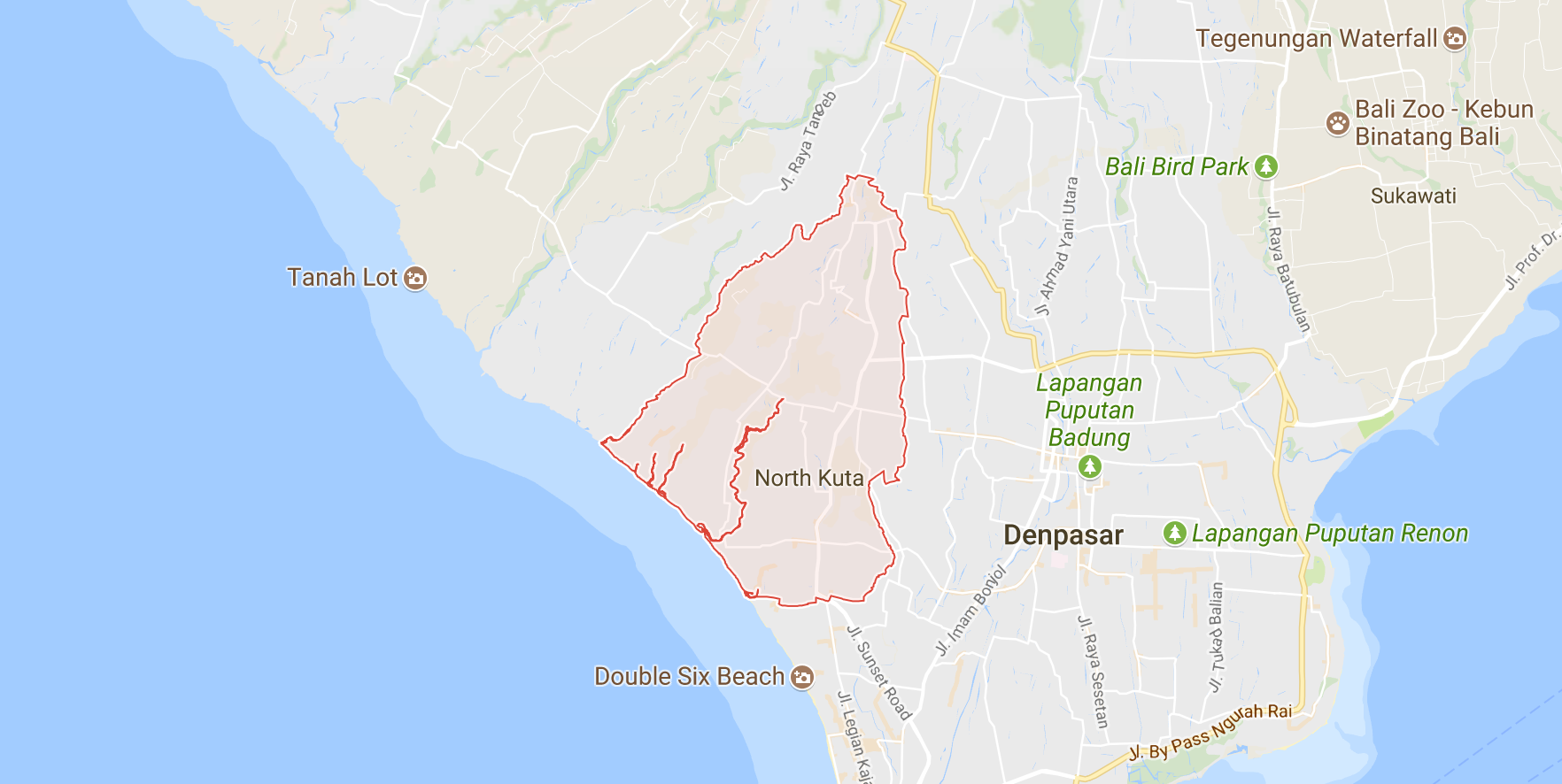
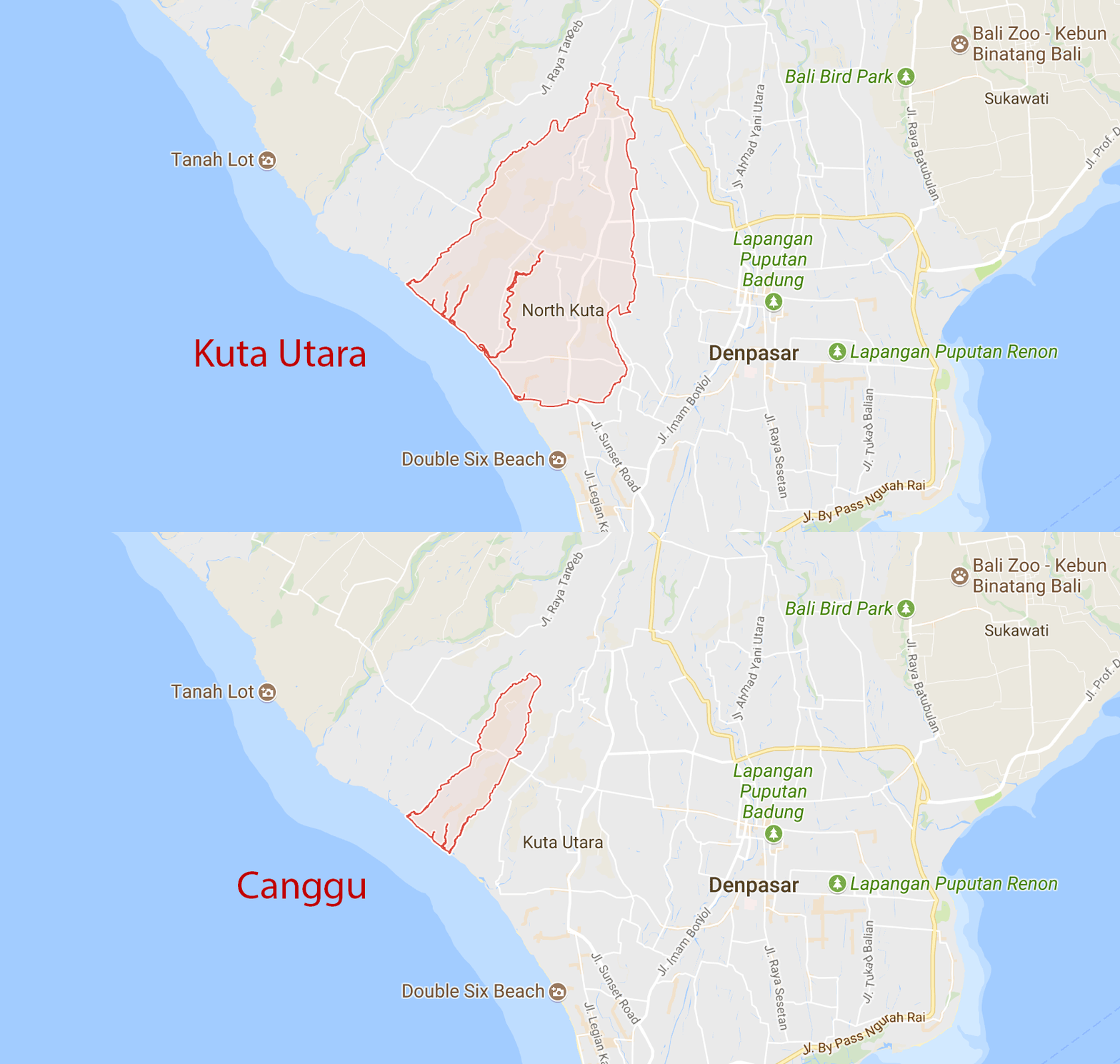
    • Kuta Utara (“north Kuta”) is one of the six “kecamatan” (“districts”) within Badung Regency:
      Map showing North Kuta's boundaries Here’s an animation showing all six of Badung’s districts in succession:
      Animation showing the borders of all six districts within Badung Regency
    • Last is Canggu, our “desa” (“village”) within Kuta Utara:
      Animation showing the borders of North Kuta and Canggu

And that’s that! It’s worth noting that the above example is somewhat of an ideal case. For example, many places don’t have street numbers:

The address of Bali Dream Villa in Canggu.
From Bali Dream Villa.

Or give their address relative to a major landmark:

The address for Enigma Bali Villas
From Enigma Bali Villas.

Postal addresses aside, I’ve found it relatively straightforward to navigate around Bali. There’s generally only one way to get where you need to go, and locals (and tourists alike) are usually glad to give directions.

Five goals for my time in Bali

Yesterday, after months of planning and preparation, my wife and I arrived in Canggu, Indonesia. This little Balinese town will be our home for the next six months. Getting here required quitting our jobs, breaking the lease on our apartment, and selling/storing just about everything we owned. I’m sure there will be more details on that process in another blog post – stay tuned.

As we prepared to move, our friends and family would often ask: “Why are you moving?”, “What are going to do over there?”, “How are you going to spend all your time?”, etc. Those are big questions with long answers, but there are some goals and intentions I’ve developed that I’d like to share. Here are five.

Write

This is a big one for me – see Why I’m going to write more. In addition to blogging, I plan on continuing my daily journaling. Check out morning pages to get a sense for what that looks like.

Exercise

Over the past five years, I’ve done a mix of CrossFit, running, high-intensity interval training, and powerlifting. Each had their ups and downs, and each helped me better understand my body.

In August 2017, I decided to focus on weightlifting and began tracking my progress in several key lifts (back squat, deadlift, overhead press, bench press). Focusing on a few compound lifts let me (1) improve my form, (2) lower my risk of injury, (3) measure my strength over time, and (3) reduce the time I spent in the gym. In all, this has resulted in an exercise routine that I both enjoy and believe is doing my body good.

I plan on continuing this strength training routine in Bali, with the primary goal of getting my squat up to 250lbs/113kg. Doing so will require consistent training as well as eating healthy and sleeping well.

Cook

While traveling, it’s easy for me to eat out 2-3 meals each day. Though this can be fun, it can also make it difficult to eat healthy. Cooking ensures I can eat the foods that best support my body and mind.

Also, cooking creates adventure: it encourages me to explore my neighborhood (e.g. Where can I buy fresh produce?), it exposes me to new flavors and ingredients, and it connects me to the local culture and language.

Read

While living and working in San Francisco, I’d routinely read books in ~20-minute sittings, usually either at work or at home before bed. This approach netted me about 3 total hours of book-reading time each week (in addition to countless hours reading on my phone and computer).

In Bali, I’m going to block 45 minutes each day to read books. Reading for extended periods of time is challenging for me – creating the time, blocking out external distractions, focusing my mind, finding a comfortable location, etc – and I’d like to practice the skill.

Learn the language

Learning Bahasa Indonesia will enable me to participate more in the local community. It should also be a fun challenge for my brain.


These five focus areas are intentions I’m bringing to my time abroad. In all, I think they’ll occupy something like 50% of my time each day, but it’s hard to say. I’m excited to see how they evolve as I settle in!

Why I’m going to write more

For me, the hardest part of writing has always been the time and focus it requires. I’m privileged to have many other ways to spend my time – why should I choose writing? This piece answers that question. I hope that re-reading it will motivate me should my commitment to the practice waver.

“Writing makes me smarter”

That’s Michael Lopp’s typical response when asked why he writes. It resonates deeply with me. Writing encourages me to better understand and evolve my opinions, it inspires me to research and understand diverse perspectives, and it motivates me to uncover and inform my own ignorances. If I’m ready to publish my thoughts on a subject, I expect myself to have an informed and mature perspective.

Writing is social

The internet enables conversations across time and space, and I want to participate in that dialogue. Creating this blog enables me to contribute longer-form pieces alongside my activity on other social networks. In the long run, and thinking aspirationally, I hope it helps me create a personal brand and shape my career.

Writing makes me feel good

I find writing an effective way to get into flow. It also scratches my itch to “build something” and provides a nice sense of accomplishment. Alongside my other routines and hobbies, writing brings joy and satisfaction to my life.

As I develop this writing practice, I expect my motives to evolve. I look forward to updating this post over time.

Thanks for reading!

The state of fintech – an outsider’s perspective

Note: This was first published on Medium in May 2014.


The financial services industry is a cornerstone of our modern economy. Yet throughout my tech-infused life, I find surprisingly dated practices still abound — why is my penned signature considered a security measure? Why does rolling over my 401k require snail-mailing a check? How could a $1.2 trillion industry still depend on the nearly-bankrupt U.S. Postal Service?

As someone considering where to work next, I find technology companies targeting these inefficiencies particularly appealing. As part of doing my due diligence, I’ve organized a portion of the better-known consumer/merchant-facing companies into some general buckets. Here’s how I see it:

Compiling this list, I noticed many of these products share certain traits. Notably:

  • Their interaction design is top-notch. They’ve honed in on their respective businesses, creating wonderfully simple account creation, onboarding, and conversion processes. Talk about focus.
  • Each employs a visual/motion design language that is simple, consistent, and tasteful. Such an attention to detail exudes professionalism and helps garner user trust. Building a digital experience that feels “safe” is no small task.
  • Compared to the existing major players in their respective markets, each has a brand and pitch that feels fresh — geared more towards younger, more tech-inclined consumers. This is no more evident than in their very names: the grandiose, old-timey, family names (“Wells Fargo”, “Goldman Sachs”, “Morgan Stanley”, etc) are long gone.

Perhaps most important, though, was the realization that these offerings are all incremental improvements on well-established product categories. I don’t use “incremental” with any negative connotations here — I just mean to reinforce that the core businesses weren’t born in the digital era: banking, mortgages, credit cards, etc all existed long before the modern consumer-friendly web.

What financial products/companies are internet-natives, then? It’s hard to say, but I think those in the “crowdfunding” space (e.g. Kickstarter, FundersClub, Gofundme) are compelling examples — they lack any real brick-and-mortar equivalent and have produced projects/products that wouldn’t have otherwise existed. Another segment might be the “data providers” (Yodlee, Plaid, Standard Treasury), though I’d say their potential hasn’t been widely realized. Last, one could argue for cryptocurrencies (e.g. Bitcoin, Ripple), but I think of them more as digital-evolutions, even though they’re creating quite a stir.

Categorizations aside, I think this exercise highlights the enormous potential for startups in financial services. I can’t help but feel that we’re due for some generation-defining innovation.

Flushing a toilet, the right way

Note: This was first published on Medium in April 2014.


I’ve taken a pee and it’s time to flush. Here’s what I see:

Toilet

It’s one of those fancy dual-flush toilets! So which button triggers the smaller flush? Without warning, the bathroom stall melts away and I’m sitting in a Kohler design review…

Designer A: Most people will be using our toilets to pee. So let’s make completing that process as easy as possible — the small-flush button should be big and easy to press. Fitt’s law in action, nice and simple.

Manager: Makes sense to me — get in, get out, get on with life.

Designer B: Hold on a sec. Let’s think of our users’ mental model: the small button represents small water and the big button equals big water, right? Who’s going to reasonably think: I want more water, let’s hit the small button. Big buttons have big consequences, that’s just how people think about this kind of thing.

Manager: Yeah, wait, that makes total sense. The size of the button reflects the size of the flush.

Designer A: So we’re going to make people press the small button most of the time? That doesn’t feel right…

The smell of Clorox welcomes me back to reality. And there, staring me down, mocking me with their simplicity, their elegance, are those two polished-chrome buttons. And I’ve got no clue which one to press. Solution? Indiscriminately smash one and rage-quit the bathroom, appreciating a bit more the somewhat-tasteless-but-absurdly-straightforward design of the XLERATOR on the way out.

I think there are two important lessons here:

  1. Urinals are the best. Ladies have it tough.
  2. A beautiful product is not always well designed. In many ways, that flusher is delightfully intuitive (the panel is highly visible, it’s obvious where the push-targets are, you can’t push it the wrong way), really quite attractive (a modern metallic finish, clean lines, simple geometric layout), and entirely accessible (no language barriers, usable by visually/physically impaired, child-friendly), yet I’m not actually sure how to use it correctly.

I can’t finish this rant with some useful, catch-all statement about how to design a great product. That kind of BS drives me nuts. So instead, a cheers: To all those hardworking people out there making products I use, but never stop to think about. Your work is much appreciated.