Note: This was first published on Medium in April 2014.
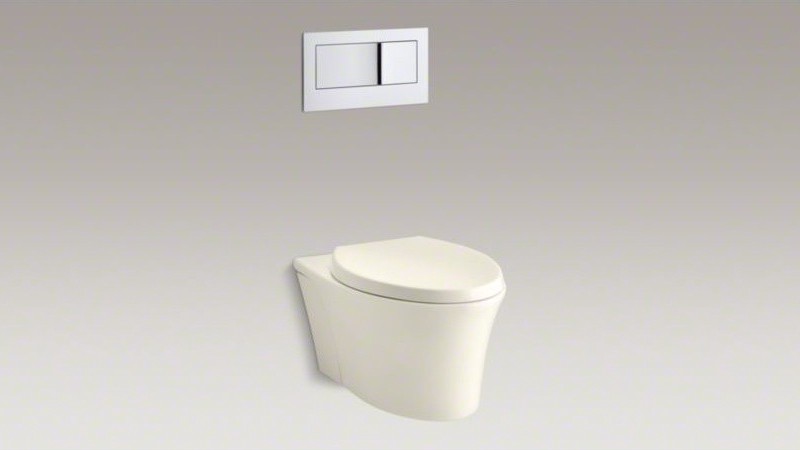
I’ve taken a pee and it’s time to flush. Here’s what I see:

It’s one of those fancy dual-flush toilets! So which button triggers the smaller flush? Without warning, the bathroom stall melts away and I’m sitting in a Kohler design review…
Designer A: Most people will be using our toilets to pee. So let’s make completing that process as easy as possible — the small-flush button should be big and easy to press. Fitt’s law in action, nice and simple.
Manager: Makes sense to me — get in, get out, get on with life.
Designer B: Hold on a sec. Let’s think of our users’ mental model: the small button represents small water and the big button equals big water, right? Who’s going to reasonably think: I want more water, let’s hit the small button. Big buttons have big consequences, that’s just how people think about this kind of thing.
Manager: Yeah, wait, that makes total sense. The size of the button reflects the size of the flush.
Designer A: So we’re going to make people press the small button most of the time? That doesn’t feel right…
The smell of Clorox welcomes me back to reality. And there, staring me down, mocking me with their simplicity, their elegance, are those two polished-chrome buttons. And I’ve got no clue which one to press. Solution? Indiscriminately smash one and rage-quit the bathroom, appreciating a bit more the somewhat-tasteless-but-absurdly-straightforward design of the XLERATOR on the way out.
I think there are two important lessons here:
- Urinals are the best. Ladies have it tough.
- A beautiful product is not always well designed. In many ways, that flusher is delightfully intuitive (the panel is highly visible, it’s obvious where the push-targets are, you can’t push it the wrong way), really quite attractive (a modern metallic finish, clean lines, simple geometric layout), and entirely accessible (no language barriers, usable by visually/physically impaired, child-friendly), yet I’m not actually sure how to use it correctly.
I can’t finish this rant with some useful, catch-all statement about how to design a great product. That kind of BS drives me nuts. So instead, a cheers: To all those hardworking people out there making products I use, but never stop to think about. Your work is much appreciated.